


COLOUR INSPIRATION FOR YOUR HOME
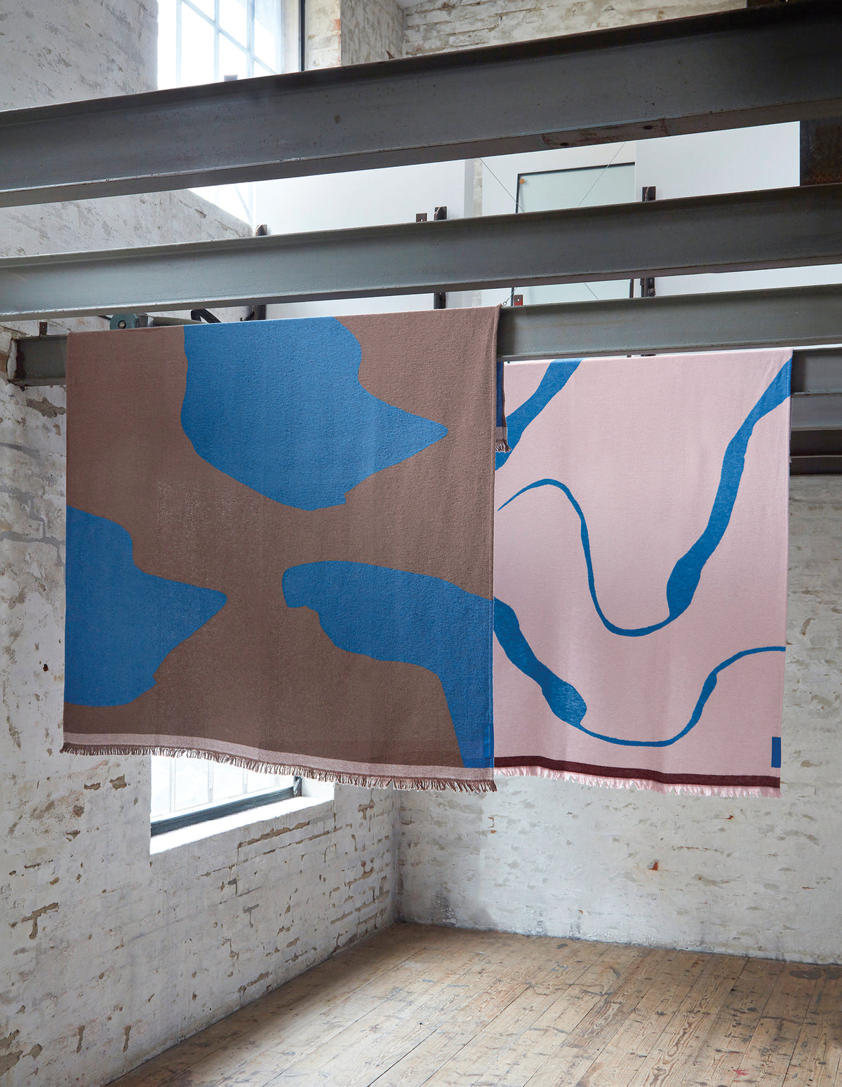
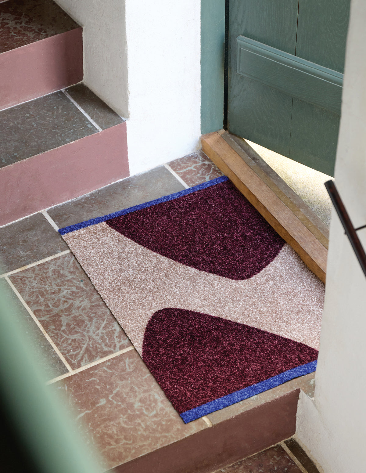
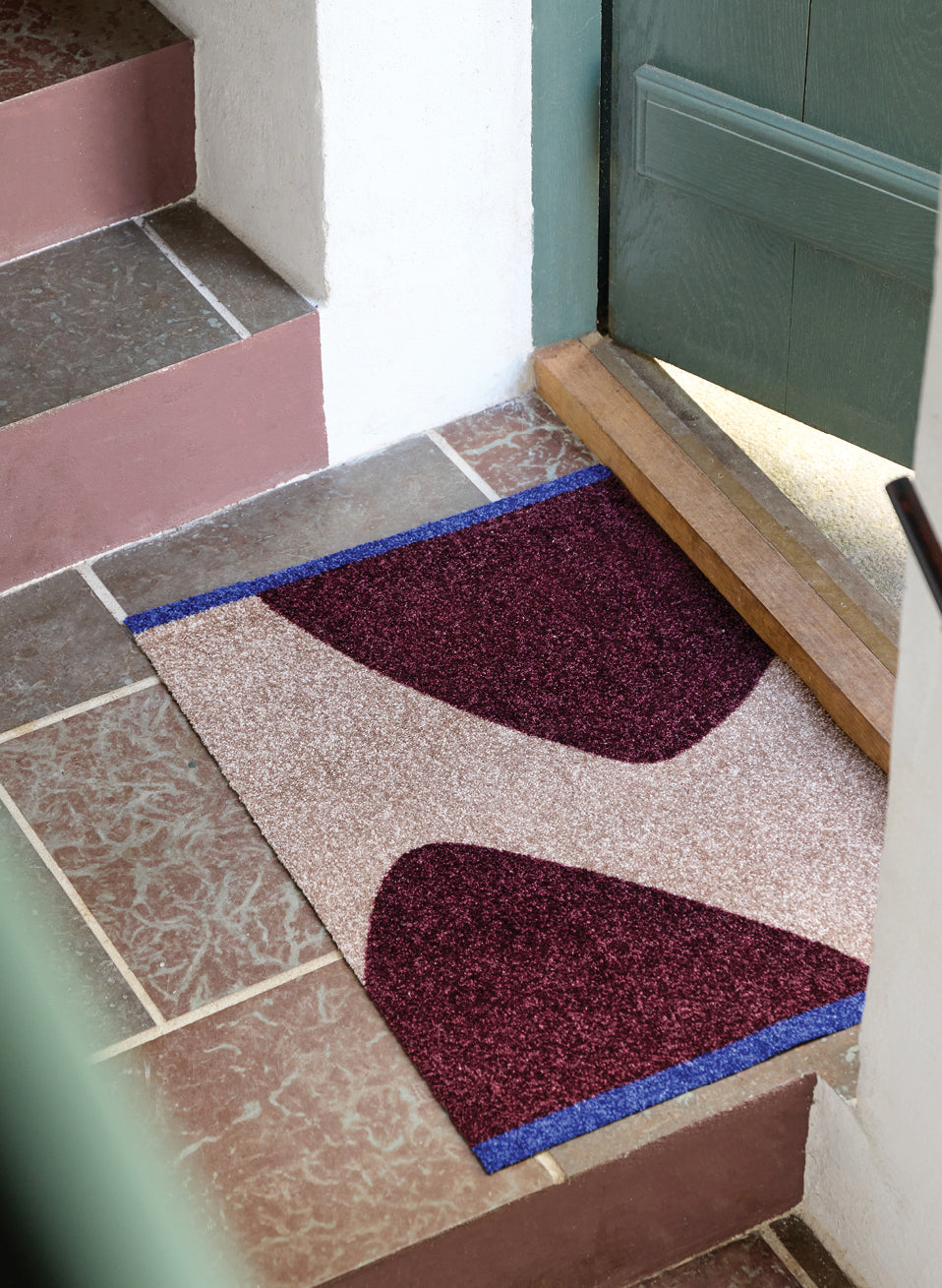
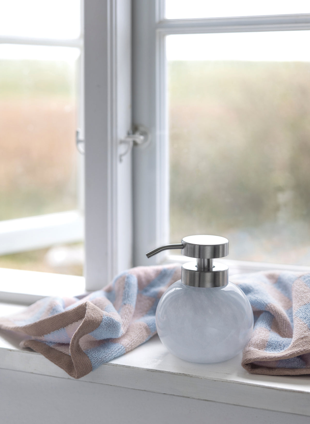
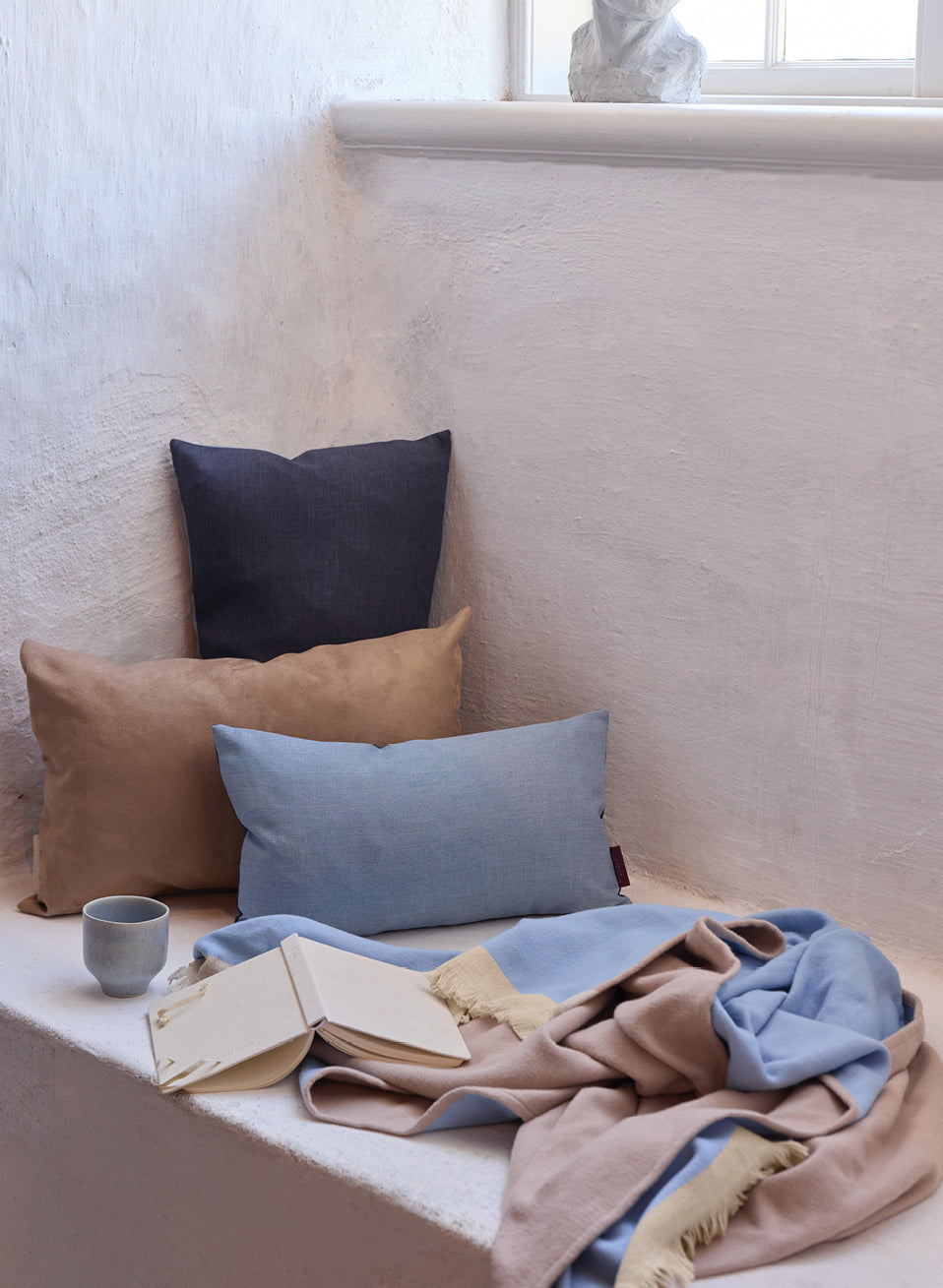
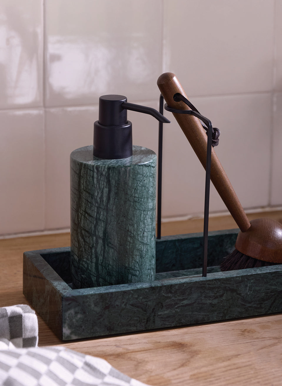
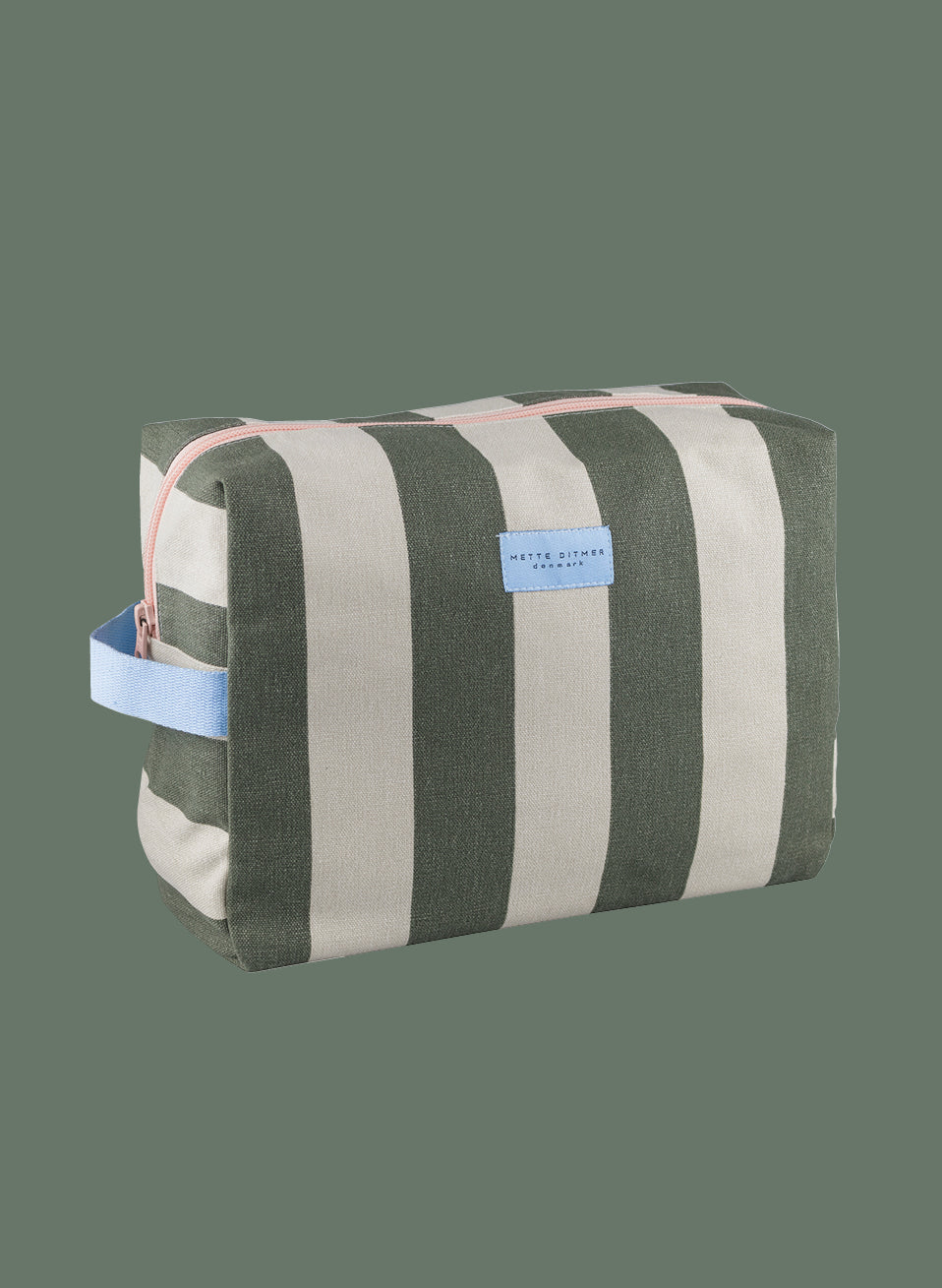
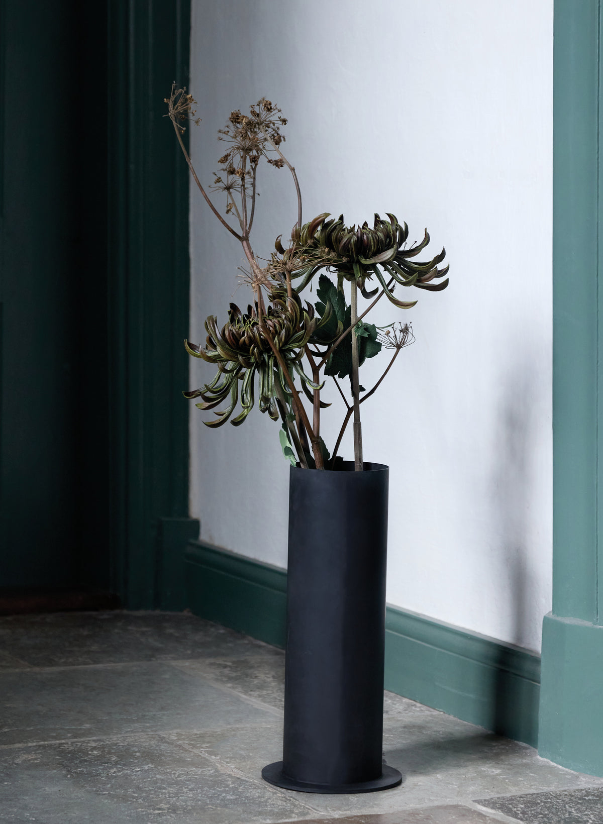
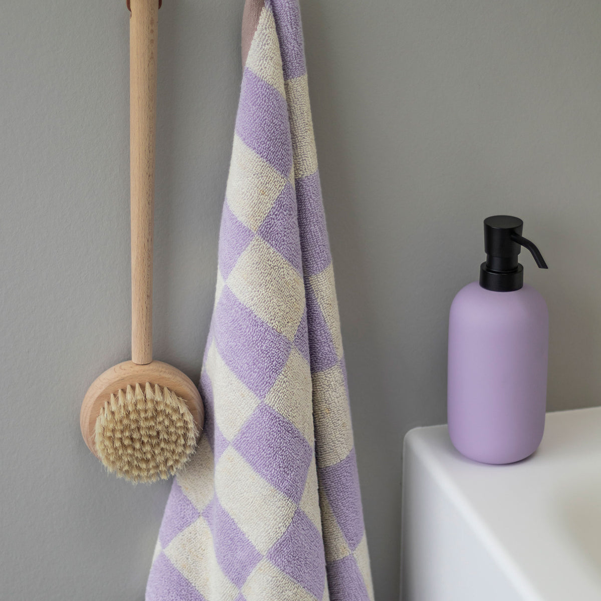
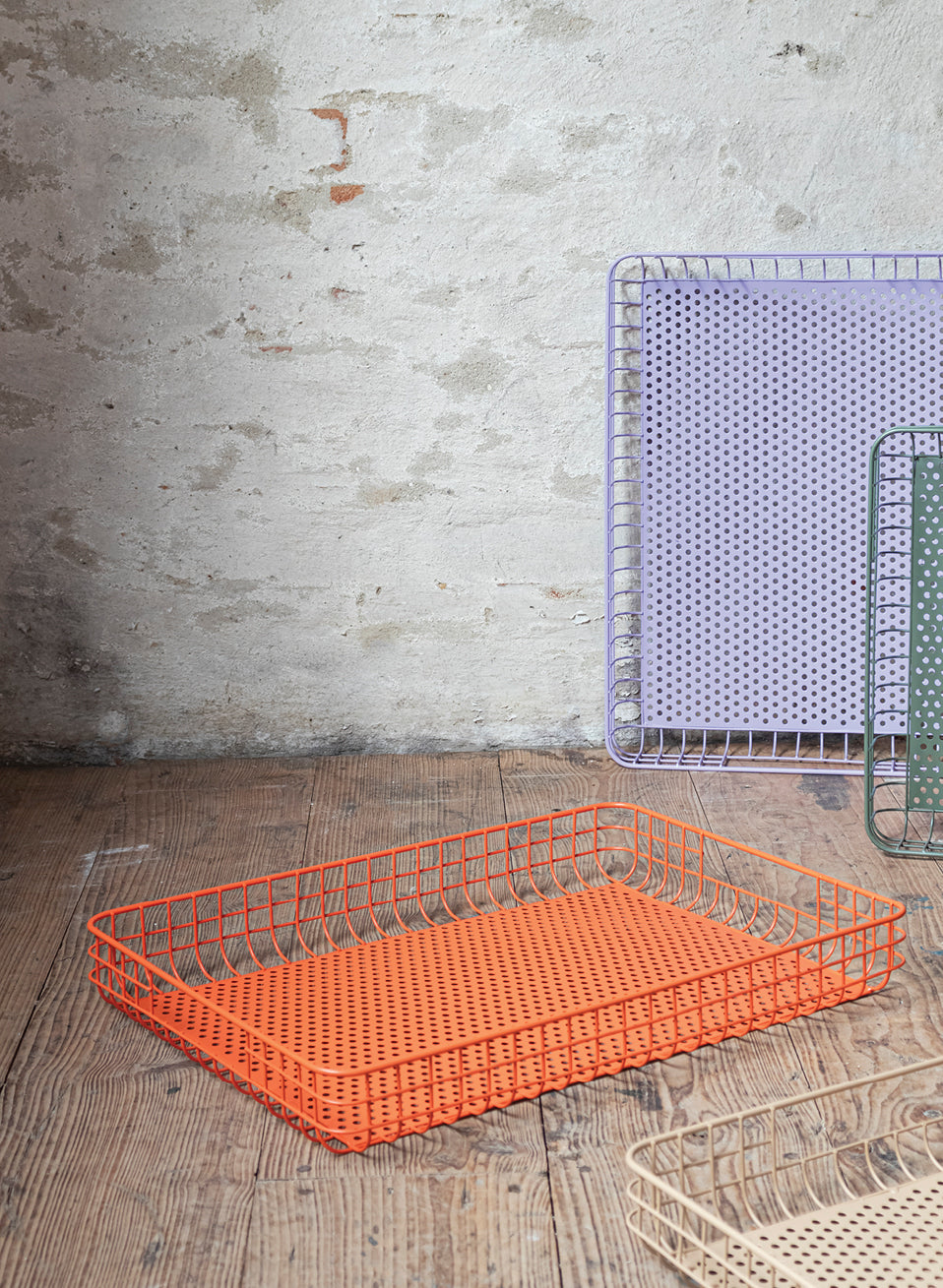
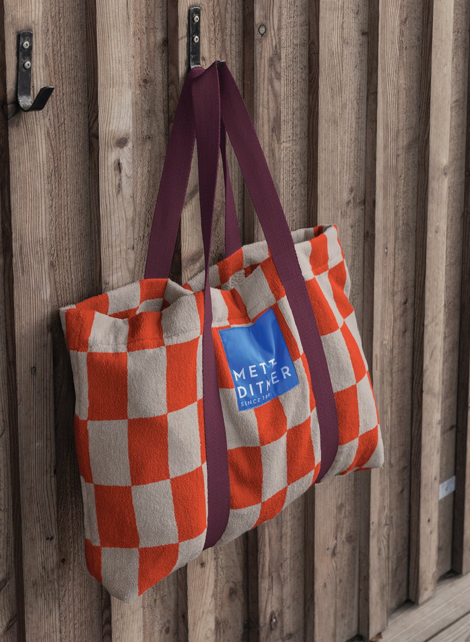
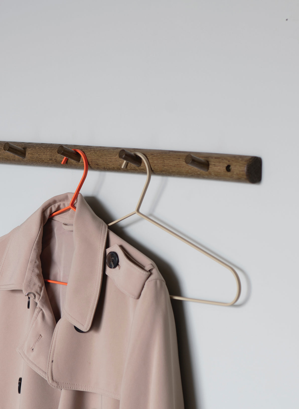
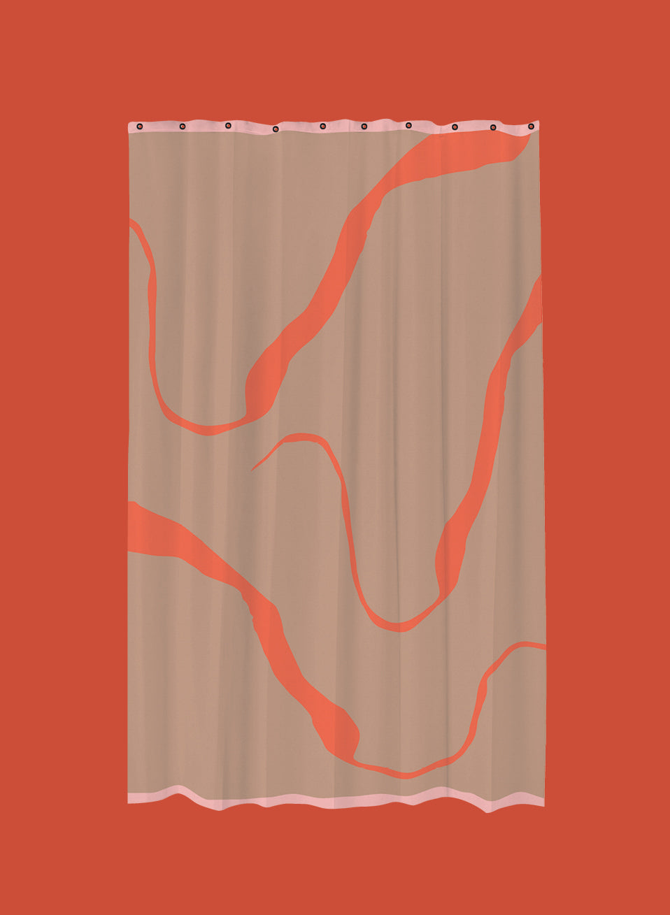
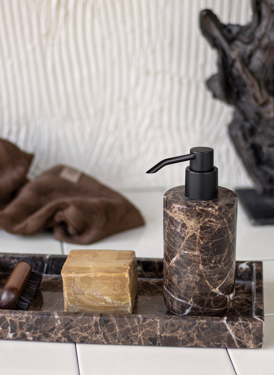
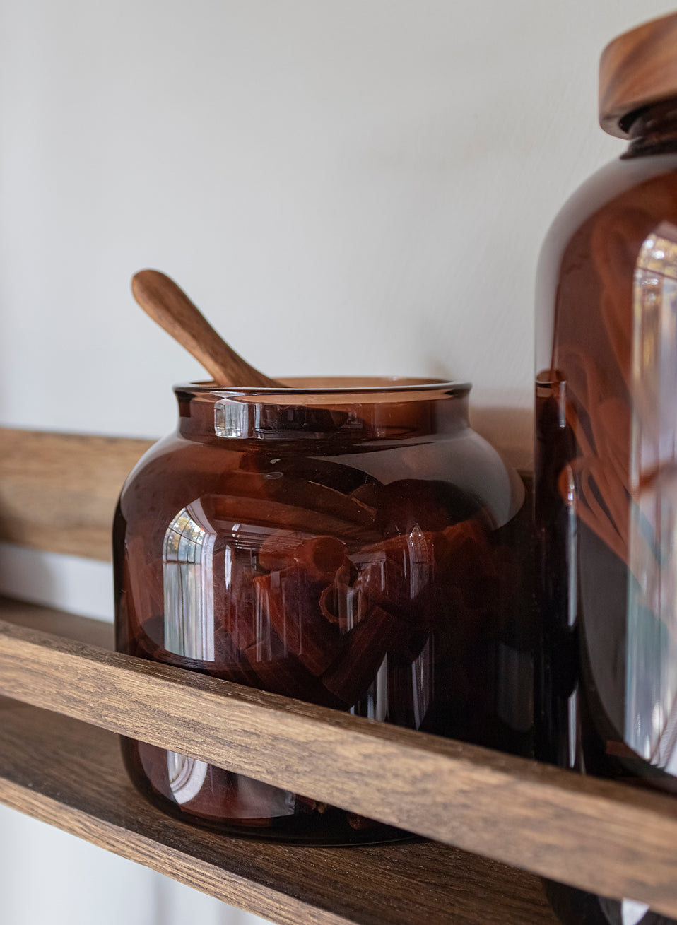
Colour has always been at the heart of Mette Ditmer’s design universe. From deep wine, vibrant orange and muted sage to warm neutrals and grounded earth tones, colour is used to create contrast and personality in the home.
Mette Ditmer carefully curates her colour palette to design home interiors that feel distinctive yet harmonious. Inspired by her own visual references and the world around her, she chooses each colour combination to work beautifully on its own or alongside others.
Explore the colours that define Mette Ditmer’s universe and find inspiration to create your own colour story at home.


METTE’S FAVOURITES


THE DETAILS THAT MATTER
For Mette Ditmer, colour is never just decoration. It is part of the design from the very beginning and a defining element of her visual language.
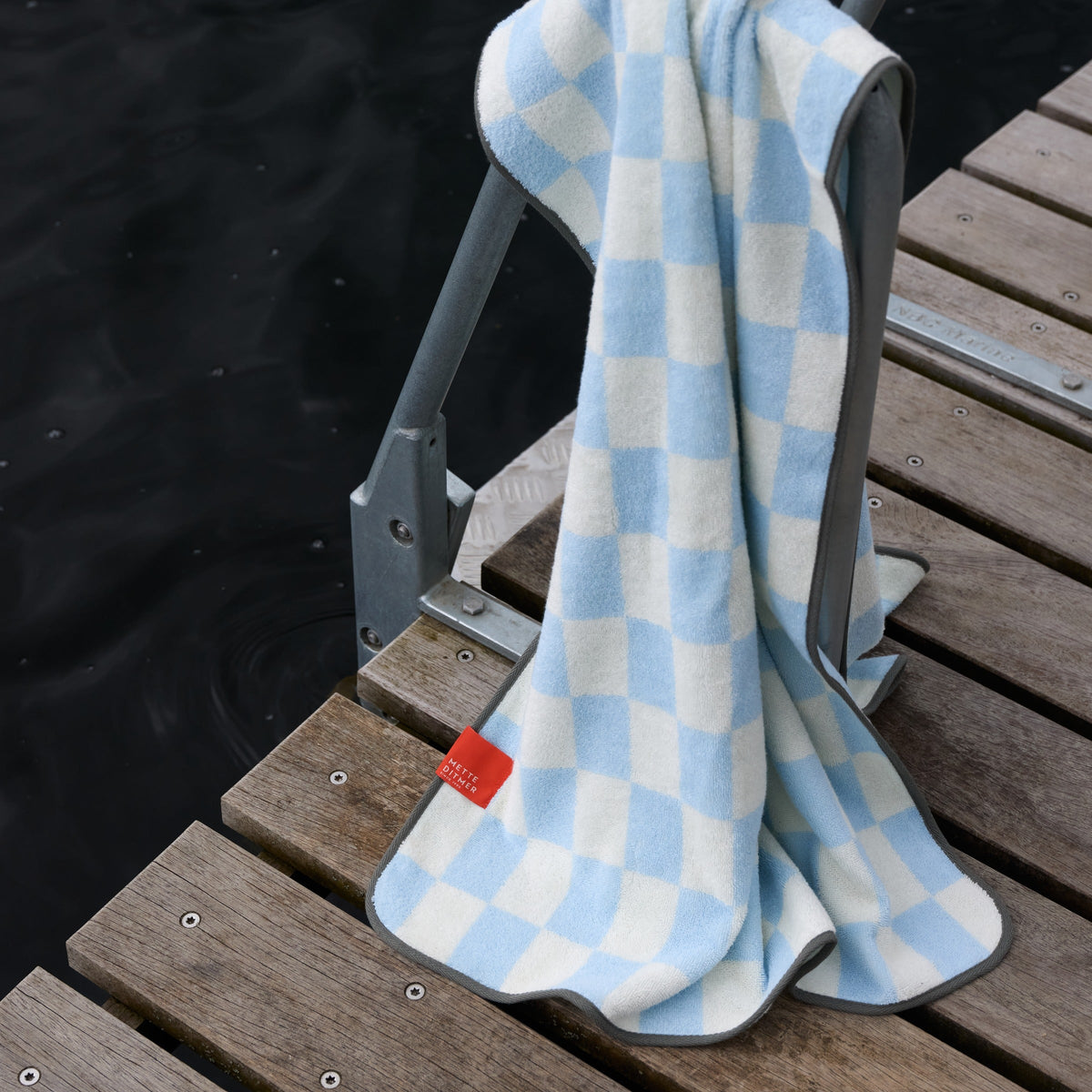
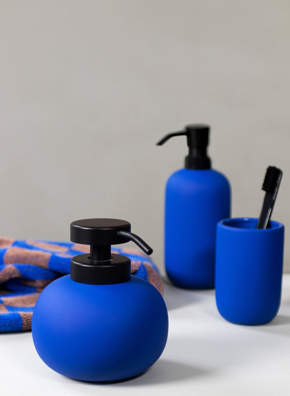
Long before a shape is settled or a material chosen, a colour is already in her mind. She is drawn to the hues that make a room come alive. A deep wine for warmth. A muted green for contrast. A blue to brighten a quiet corner. She uses colour to create balance, add personality and bring a little unexpectedness to living spaces.
A COLOURFUL HOME
Mette Ditmer trusts colour instinctively. She chooses the shades that spark something in her, whether they energise a space, create calm or simply make her smile. Colour can do more than please the eye. It can change the way a space feels. And she hopes the colours she chooses will move something in you too.
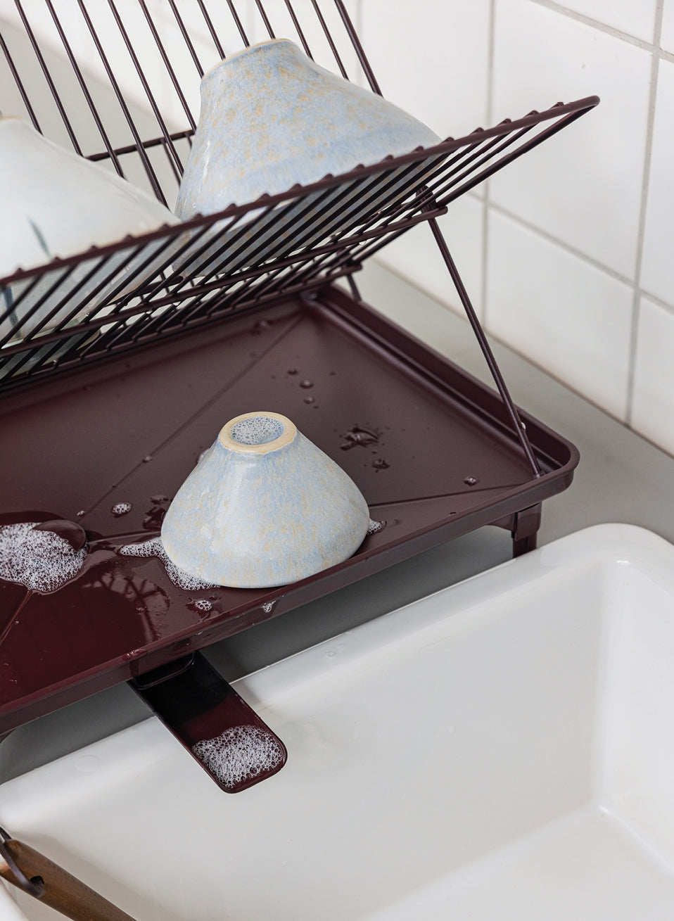
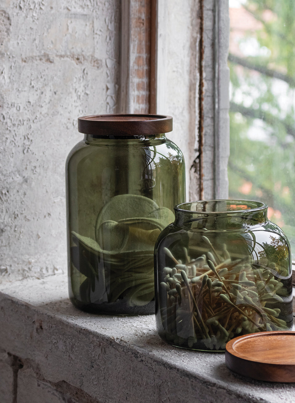
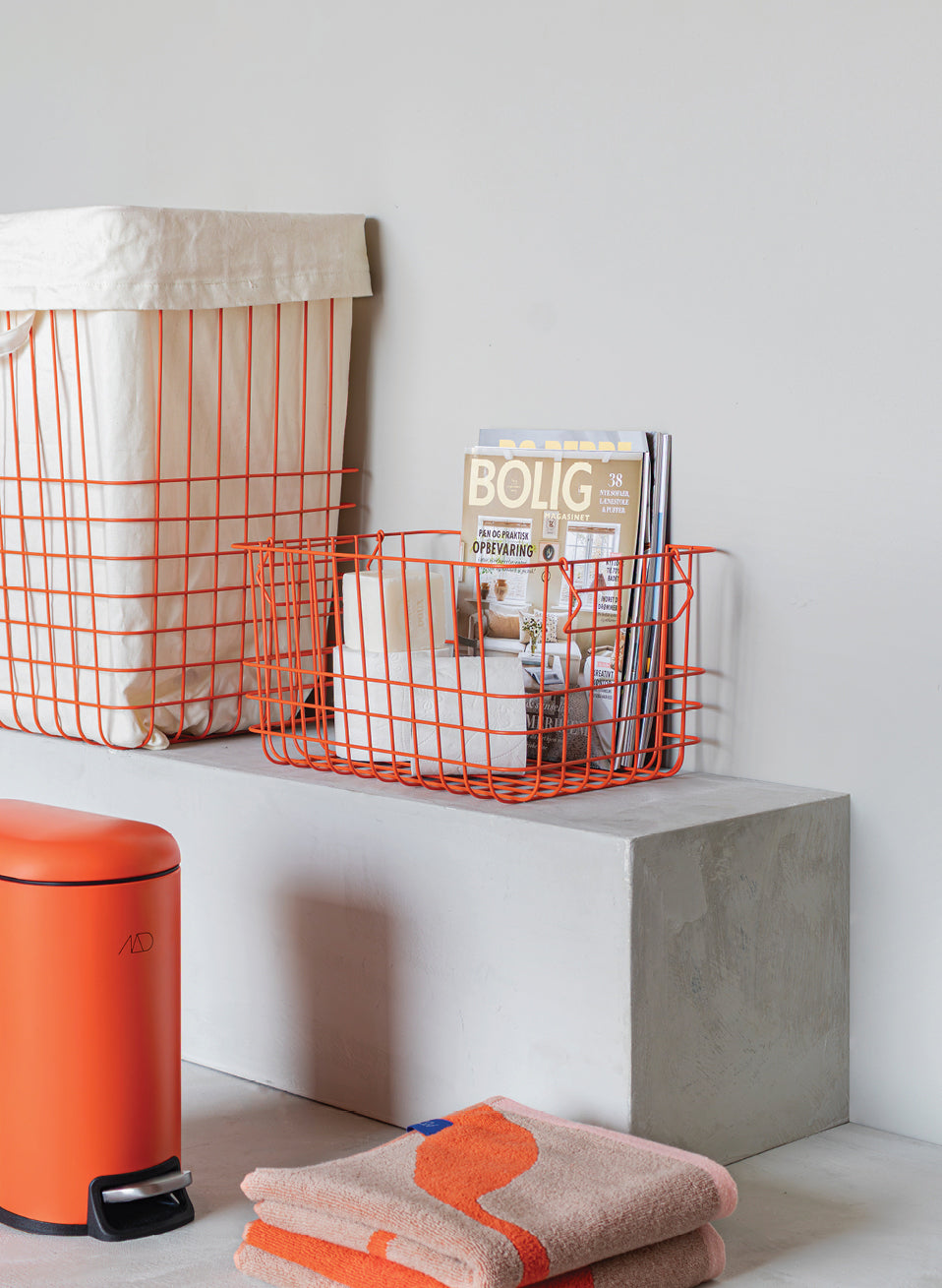
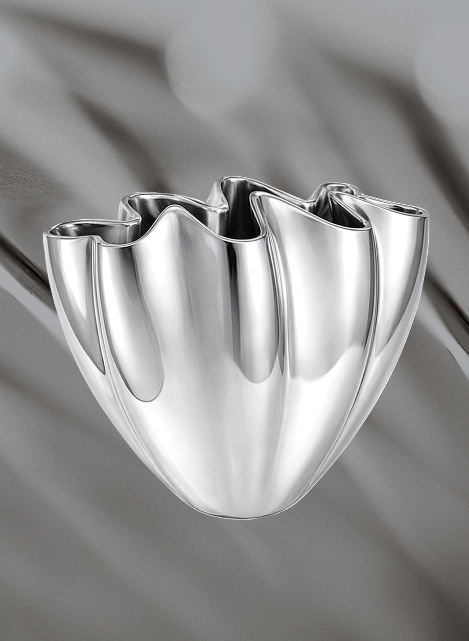
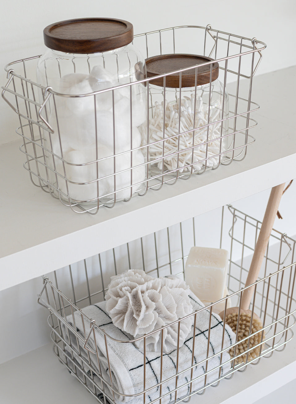
Mette Ditmer finds colour in the smallest details. A candleholder, a vase catching the afternoon light, a basket tucked beneath the sink. Nothing is accidental, and she never chooses a bold colour simply for the sake of it. For her, colour is not decoration. It is what gives a home character and can stimulate a sense of well-being and help people recharge or re-energise.
CURATED COLOUR PALETTE
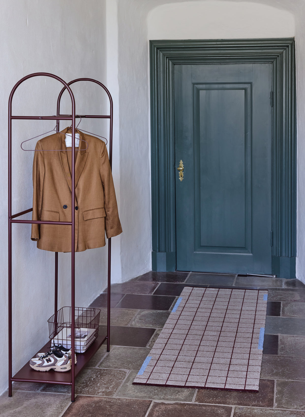
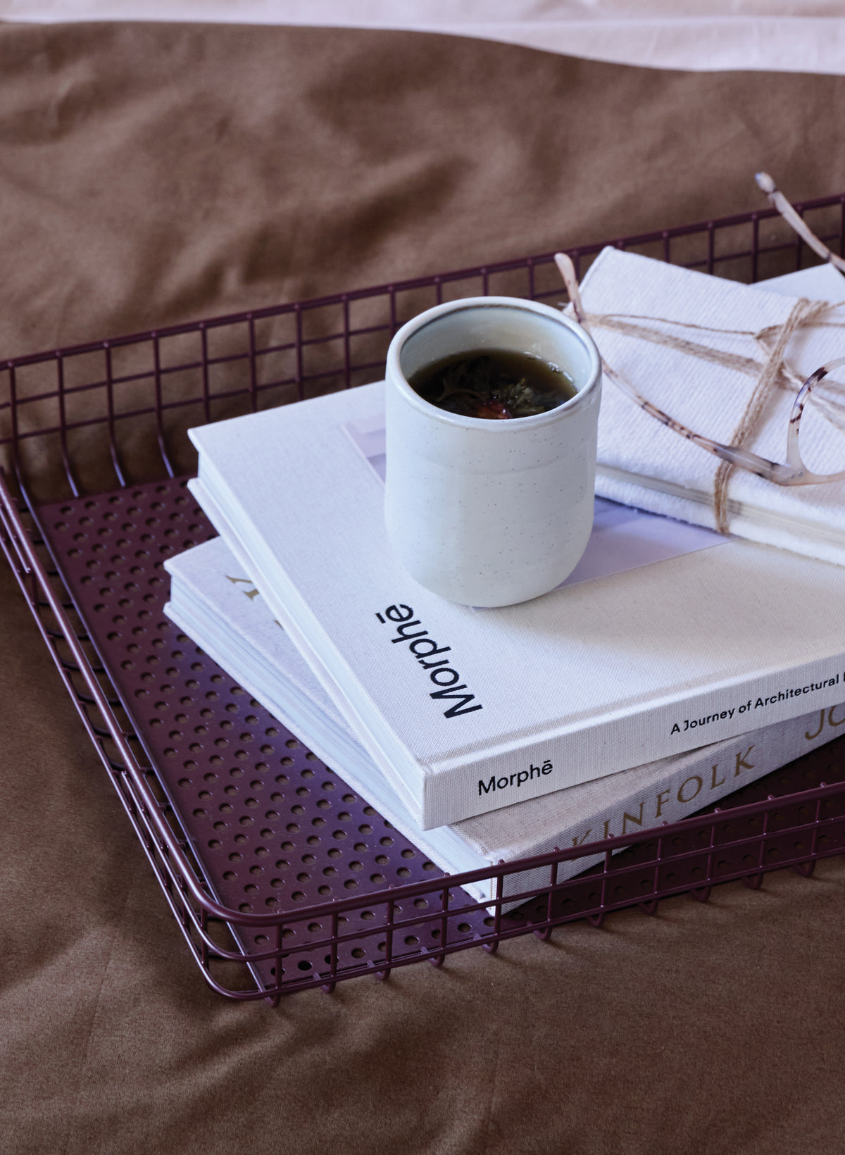
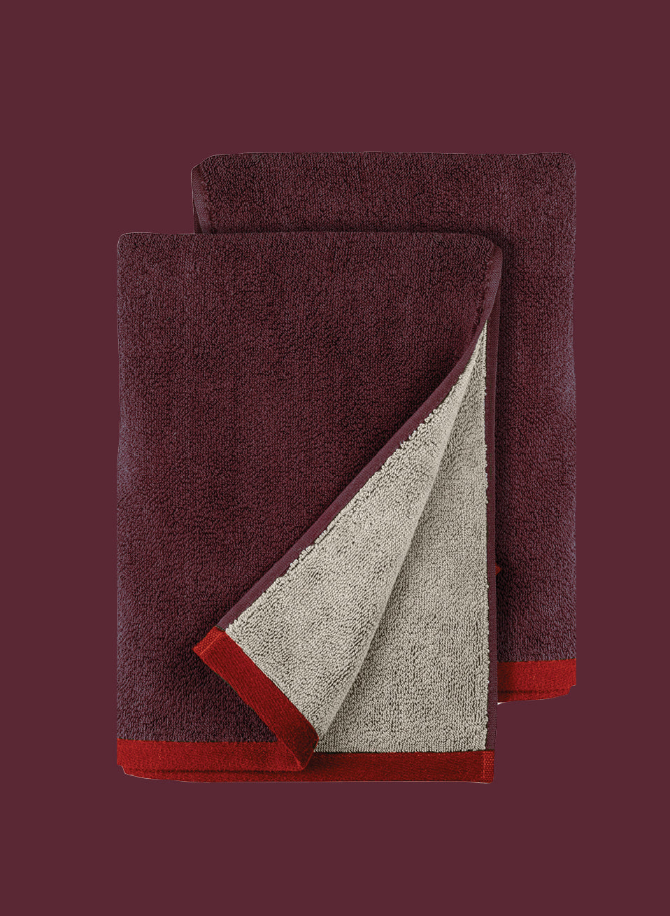
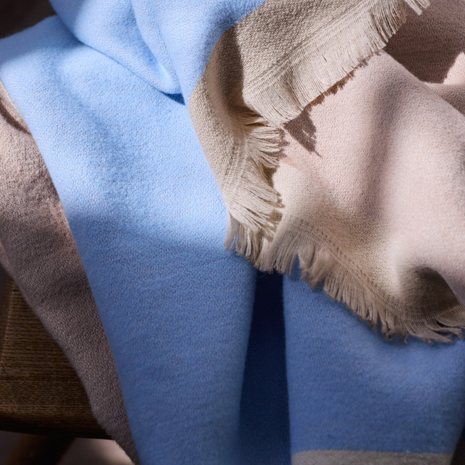
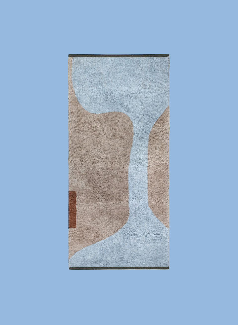
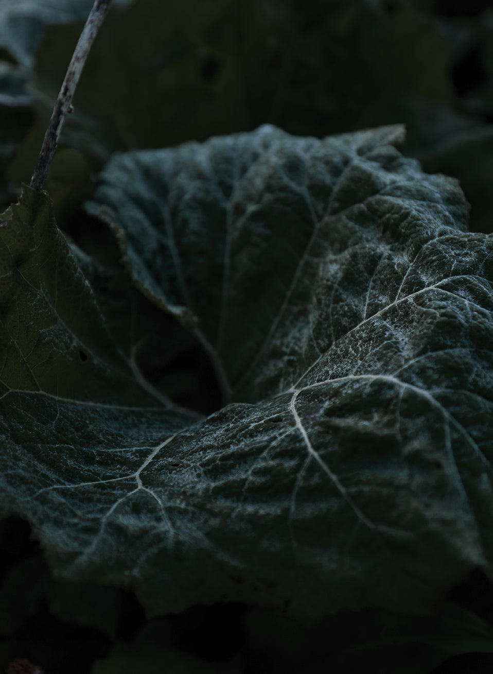
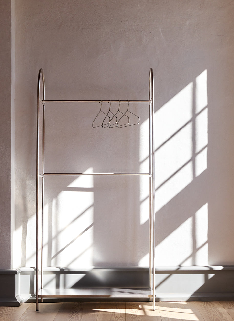
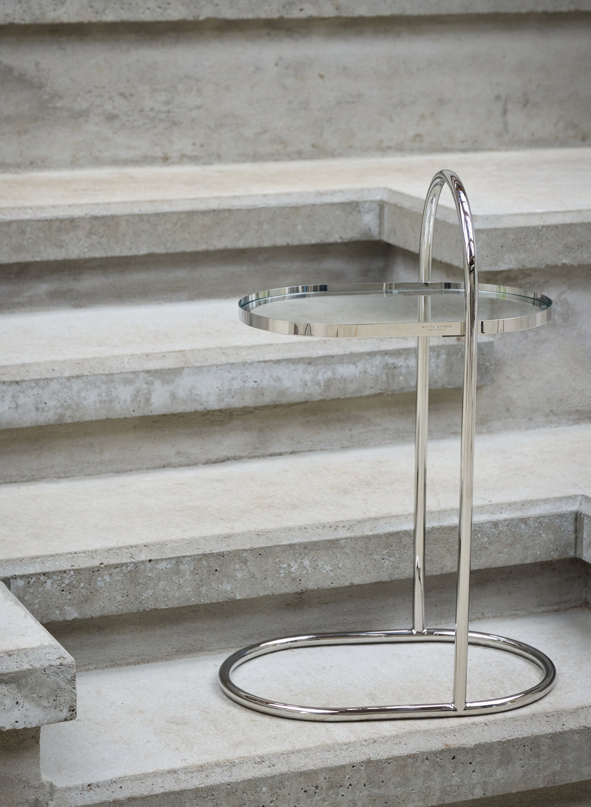
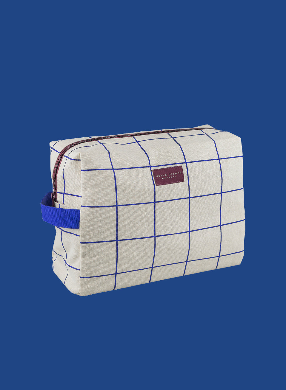
Ask Mette Ditmer to name a favourite colour and she will struggle to choose just one. Her palette shifts with the seasons and her mood: deep burgundy and forest green one moment, chrome, warm neutrals and earthy shades the next. The combinations are subtle yet daring, with thoughtful details that reflect the care behind every design.
She never chooses colours simply to follow a trend. She chooses them because they make a room feel good to come home to. Everyone has a colour they reach for without thinking, the one that just feels like them.
Choose your colour and discover where it belongs.

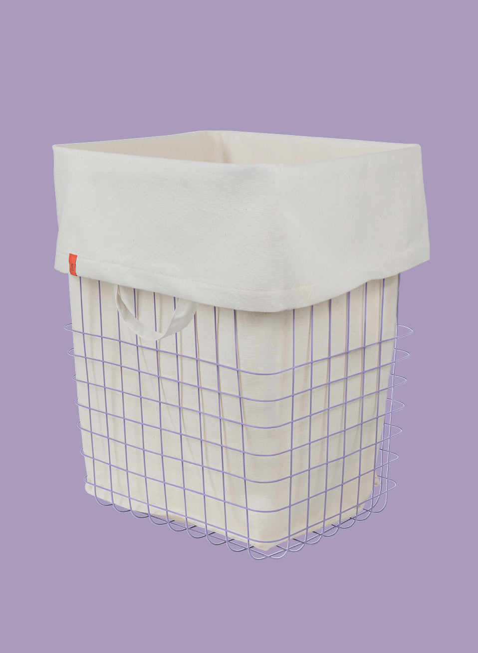
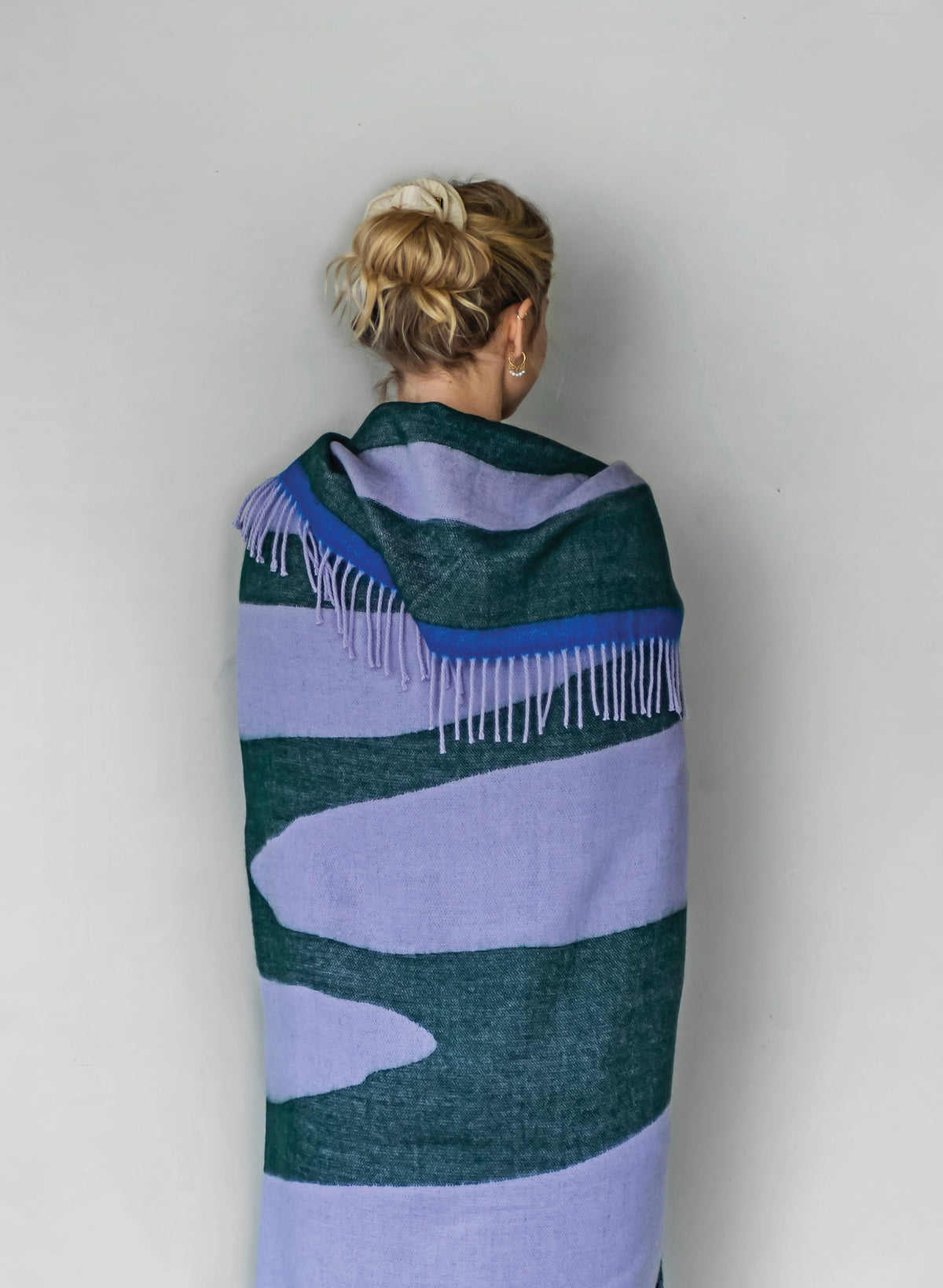
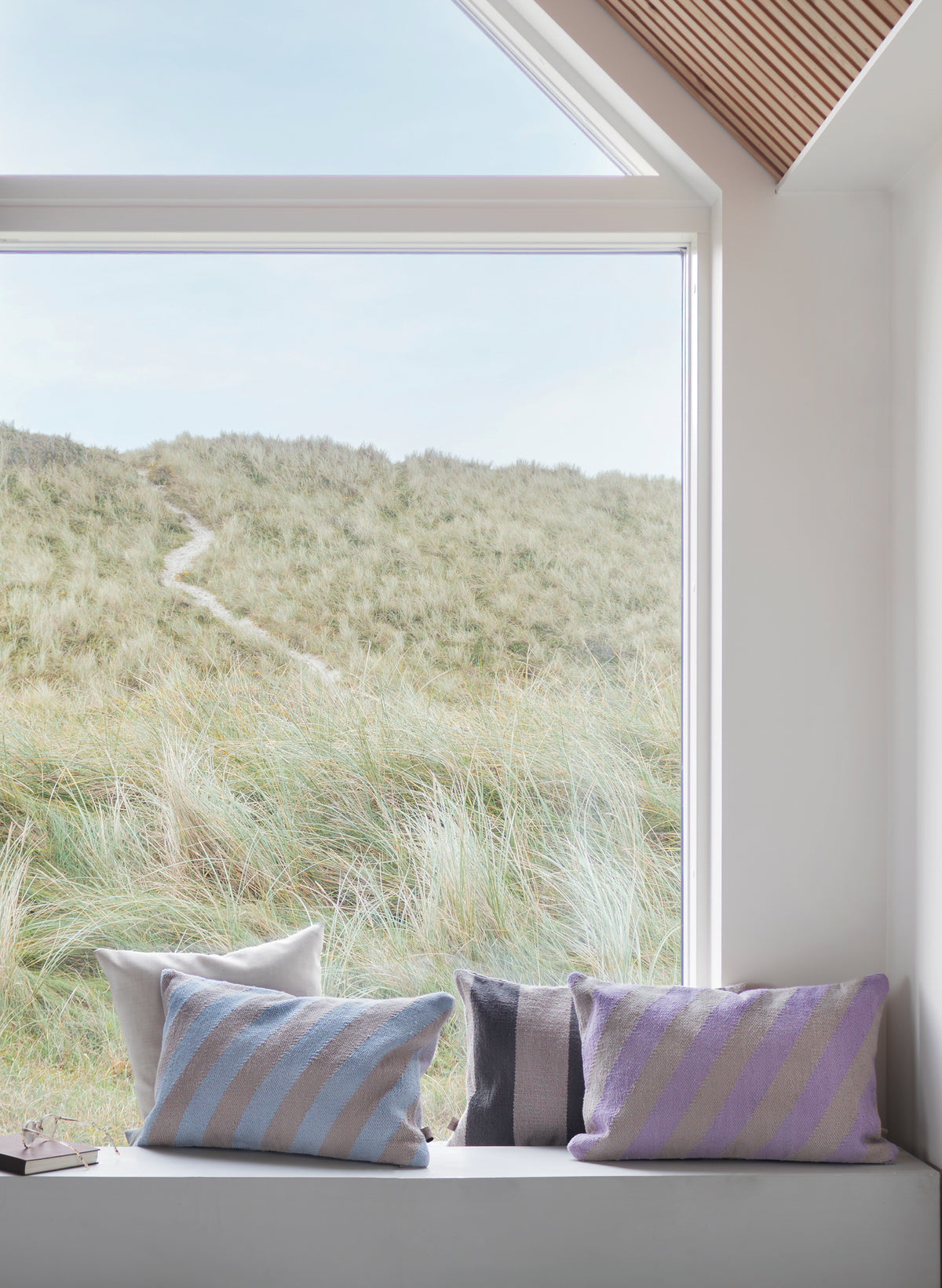

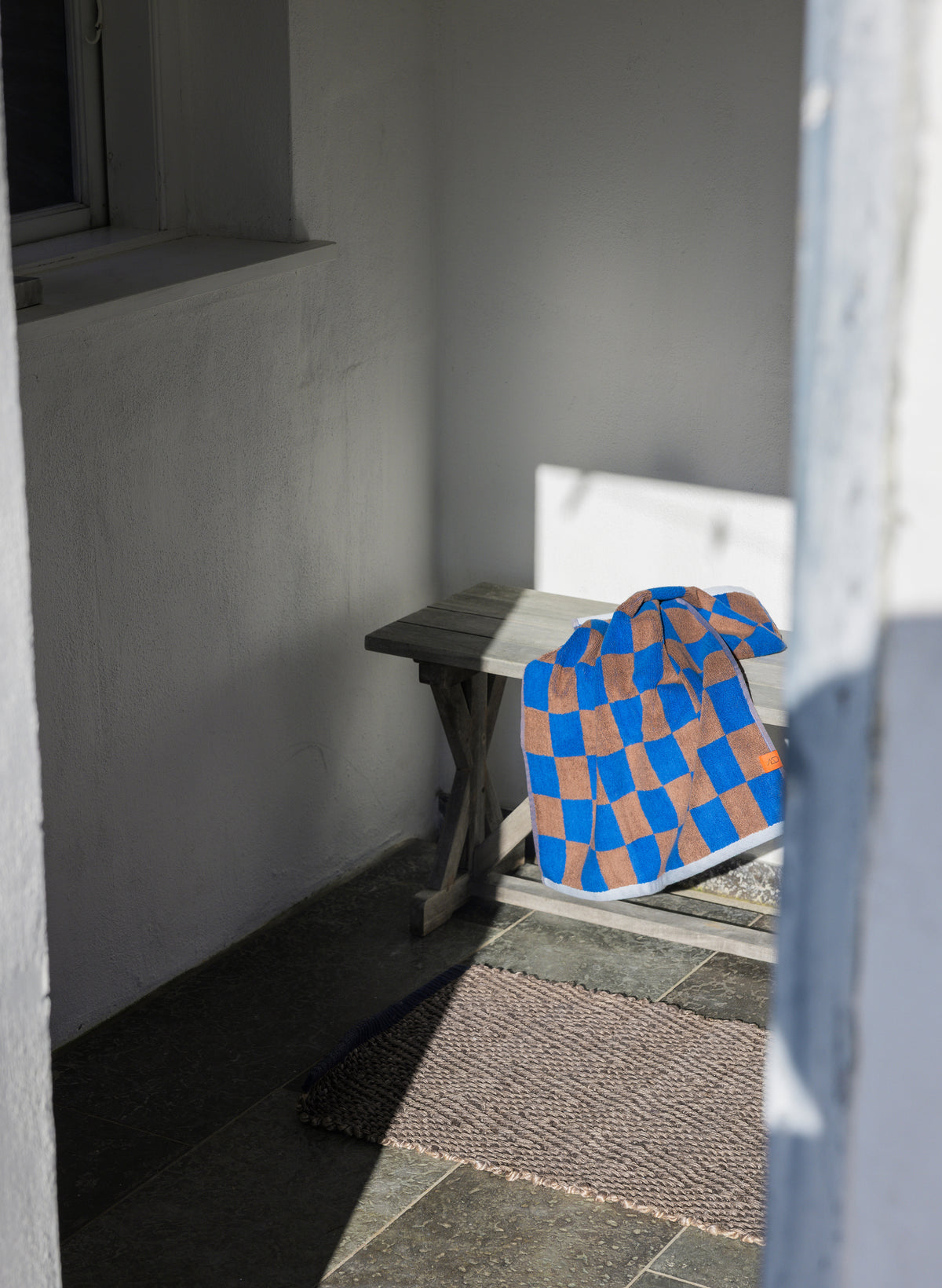
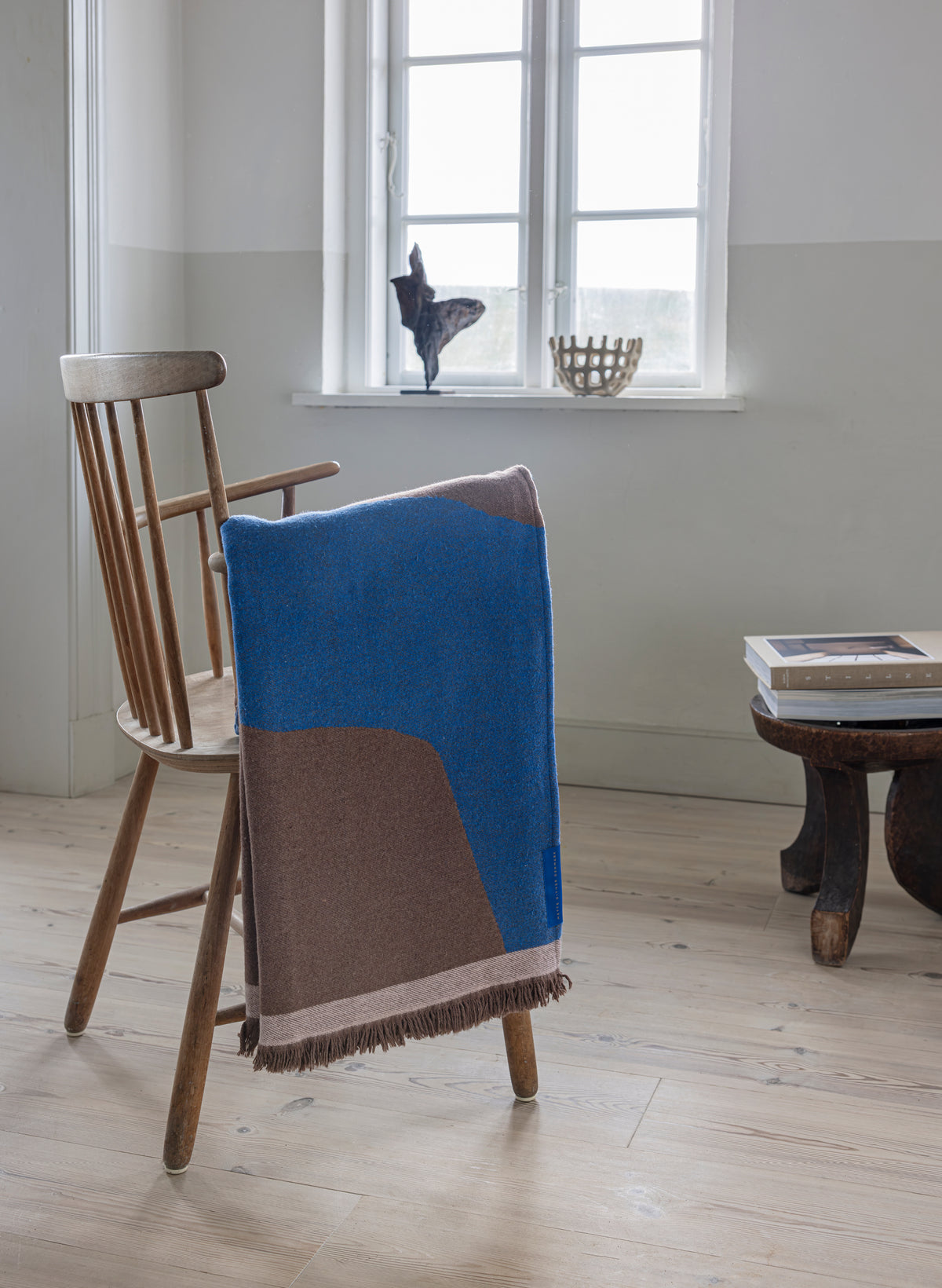
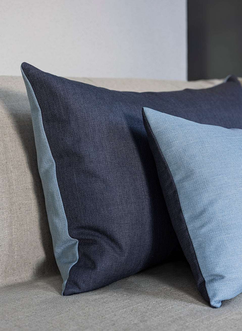
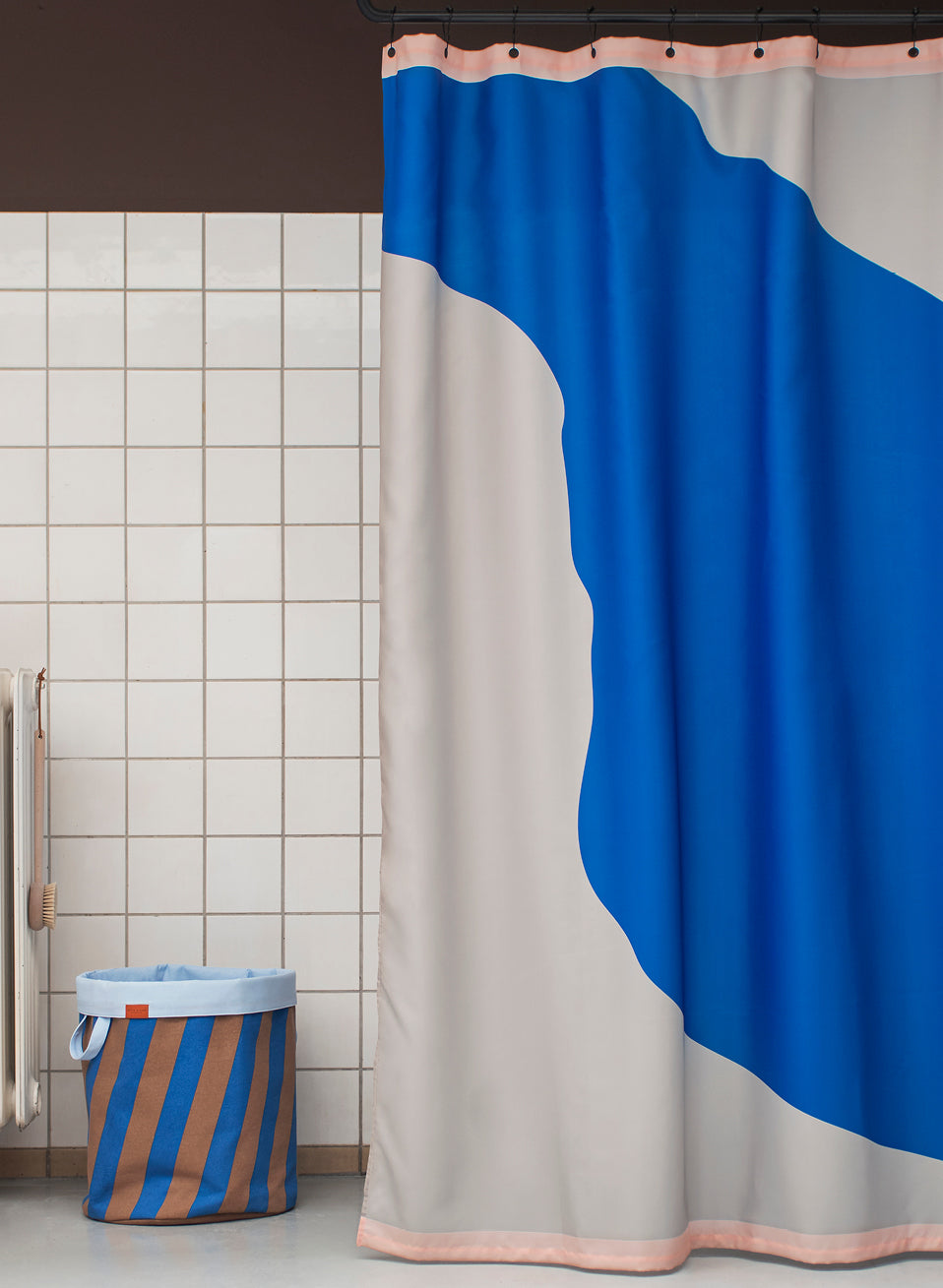
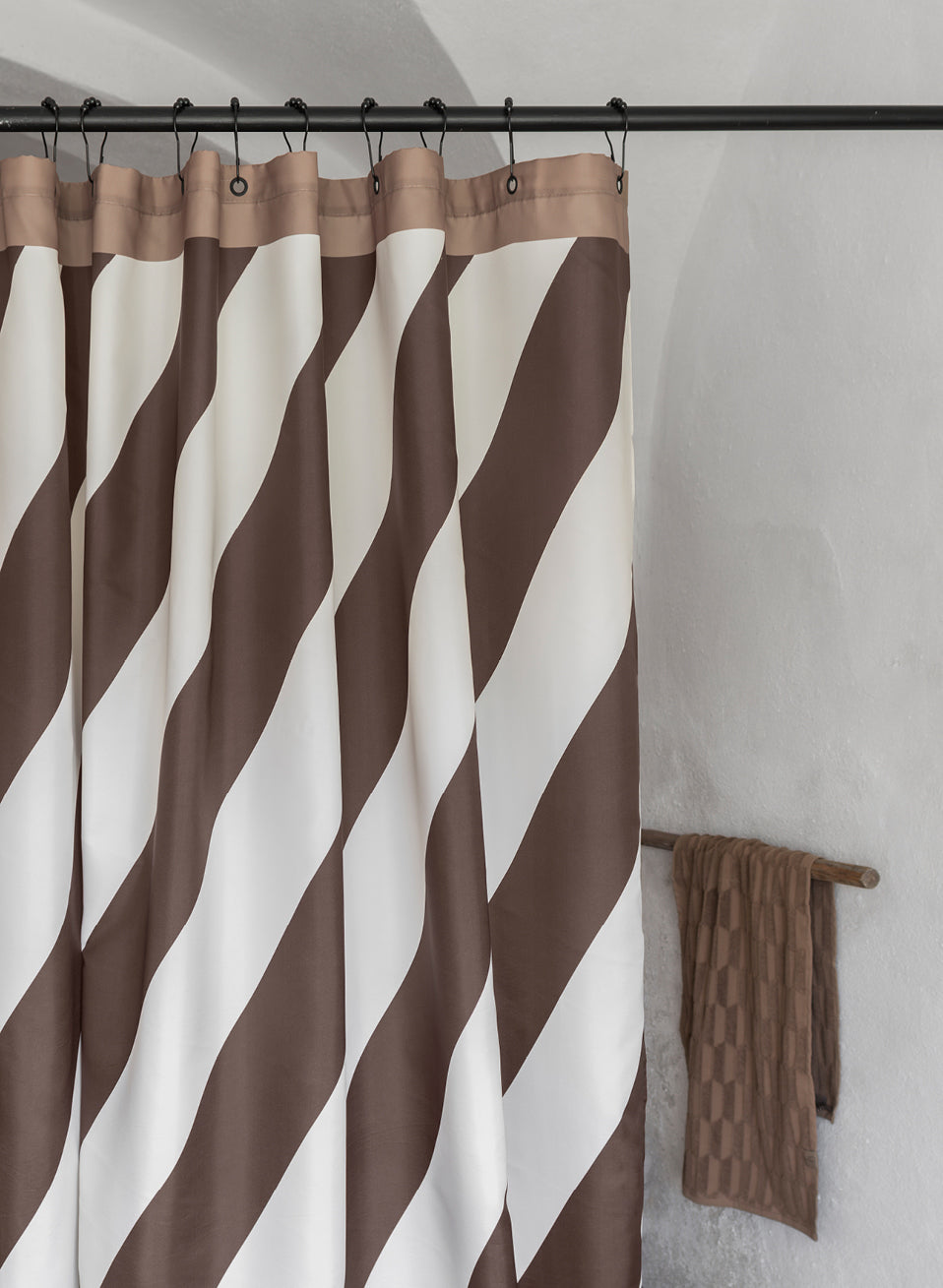
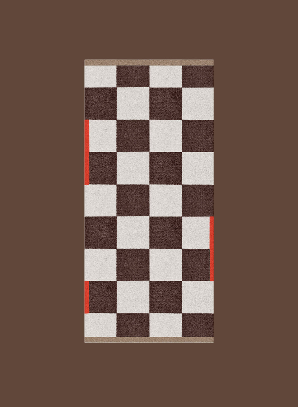
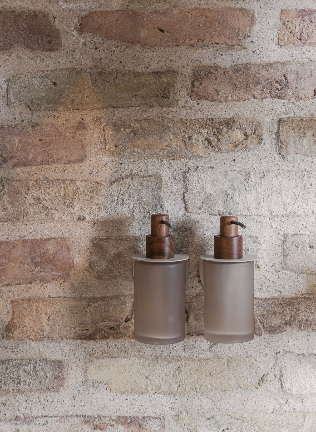
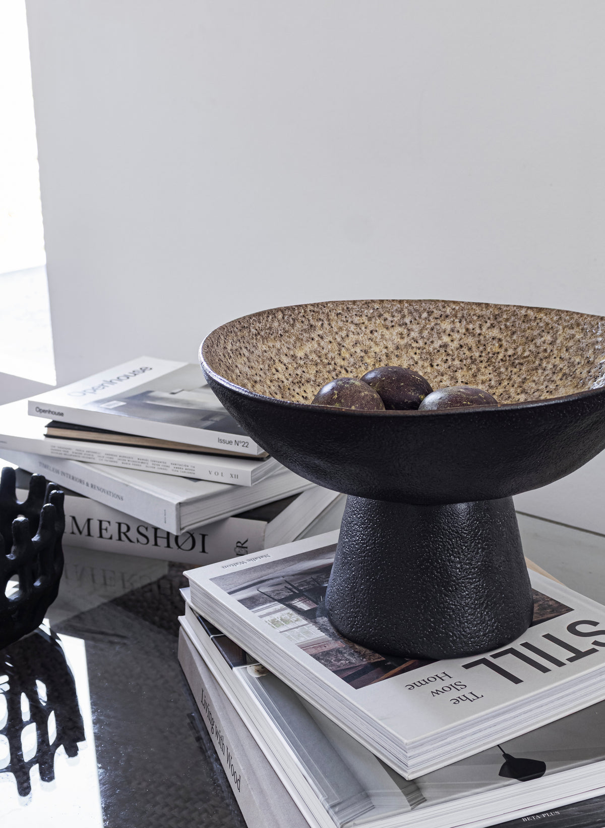


A COMMUNITY OF DESIGN ENTHUSIASTS
Colour is never a decision made alone. Mette Ditmer watches how design enthusiasts style her products, listens to which shades spark joy, and lets that energy feed straight back into her next collection. It’s a conversation that is always evolving.
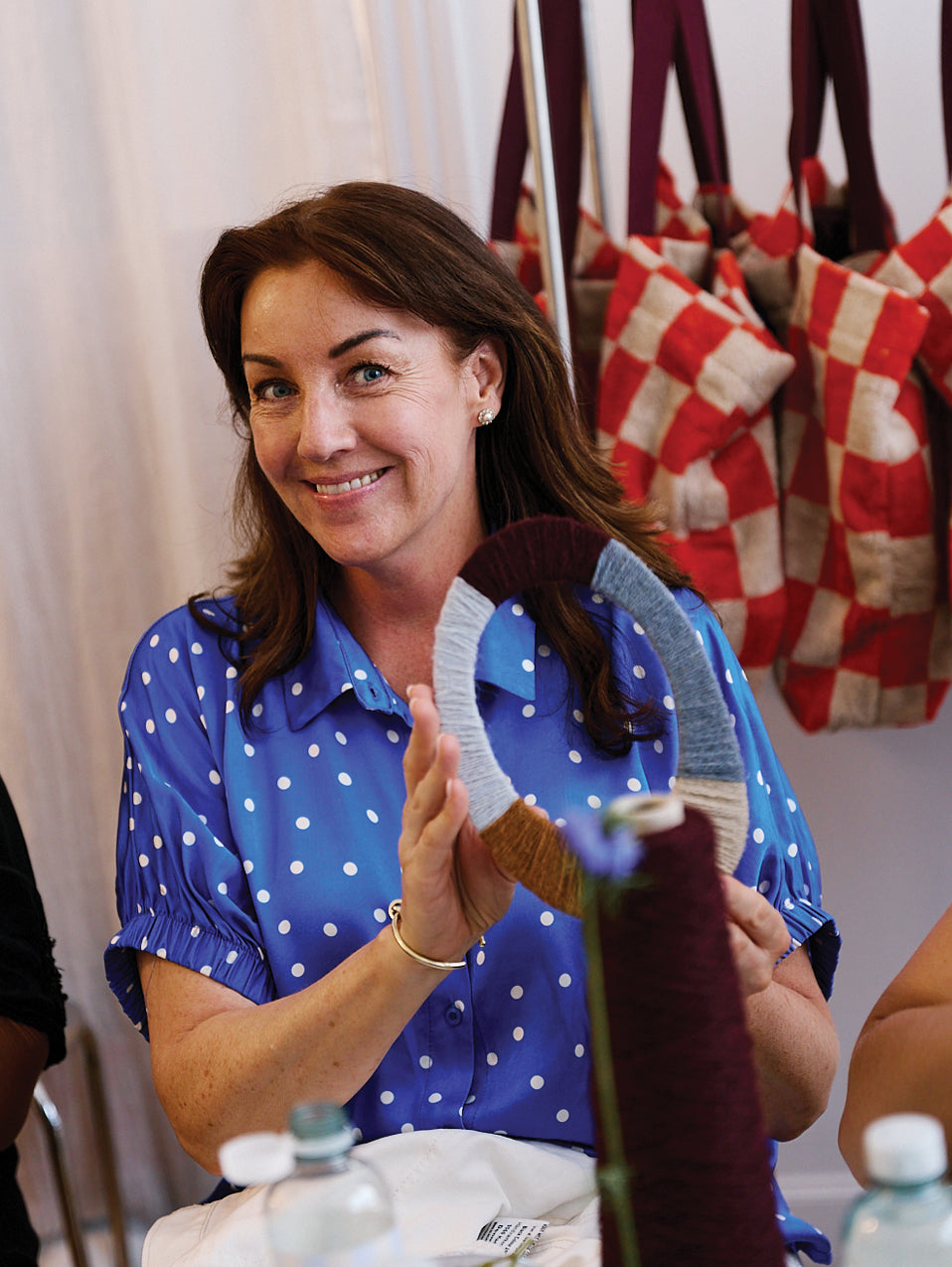
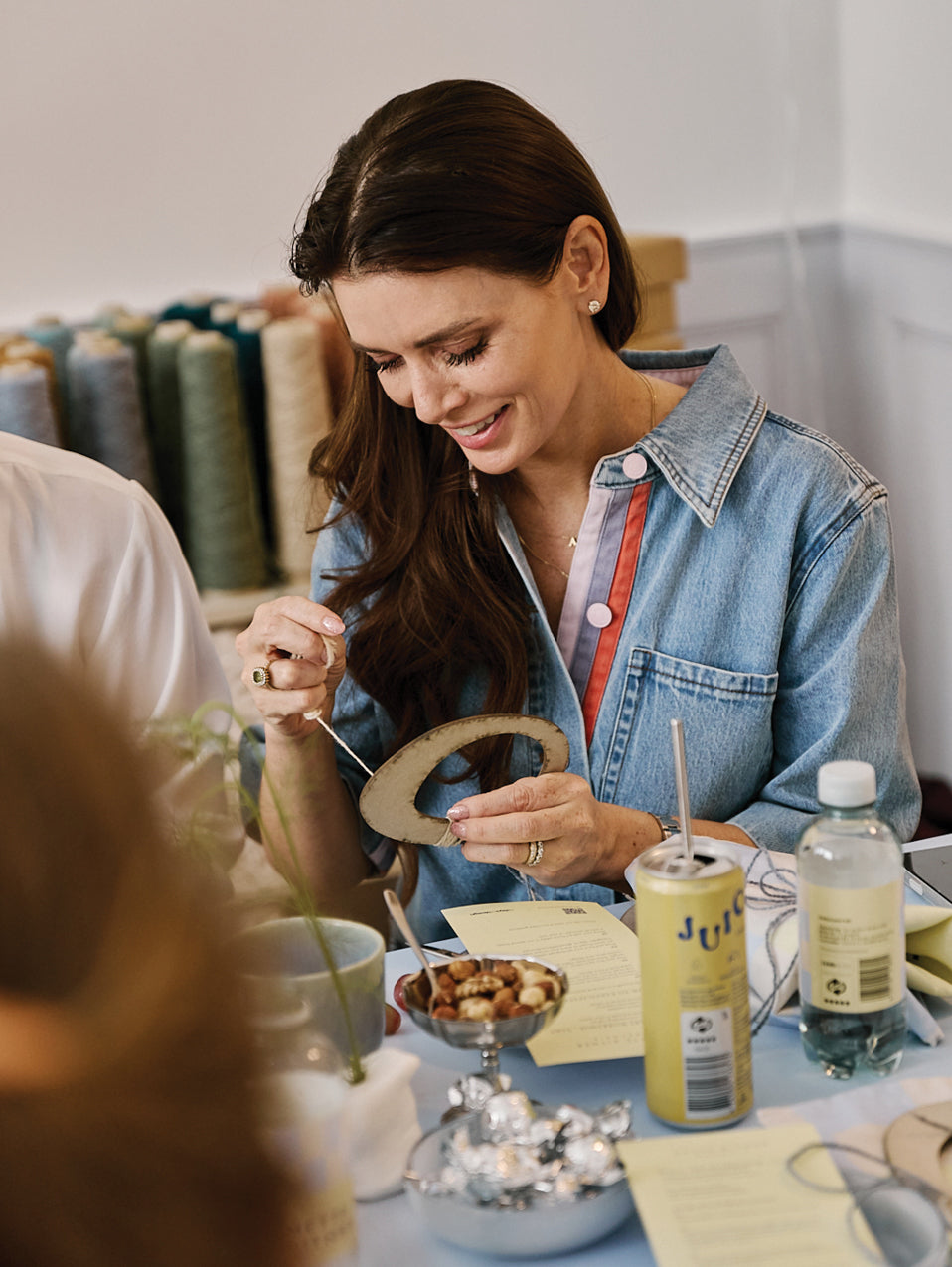
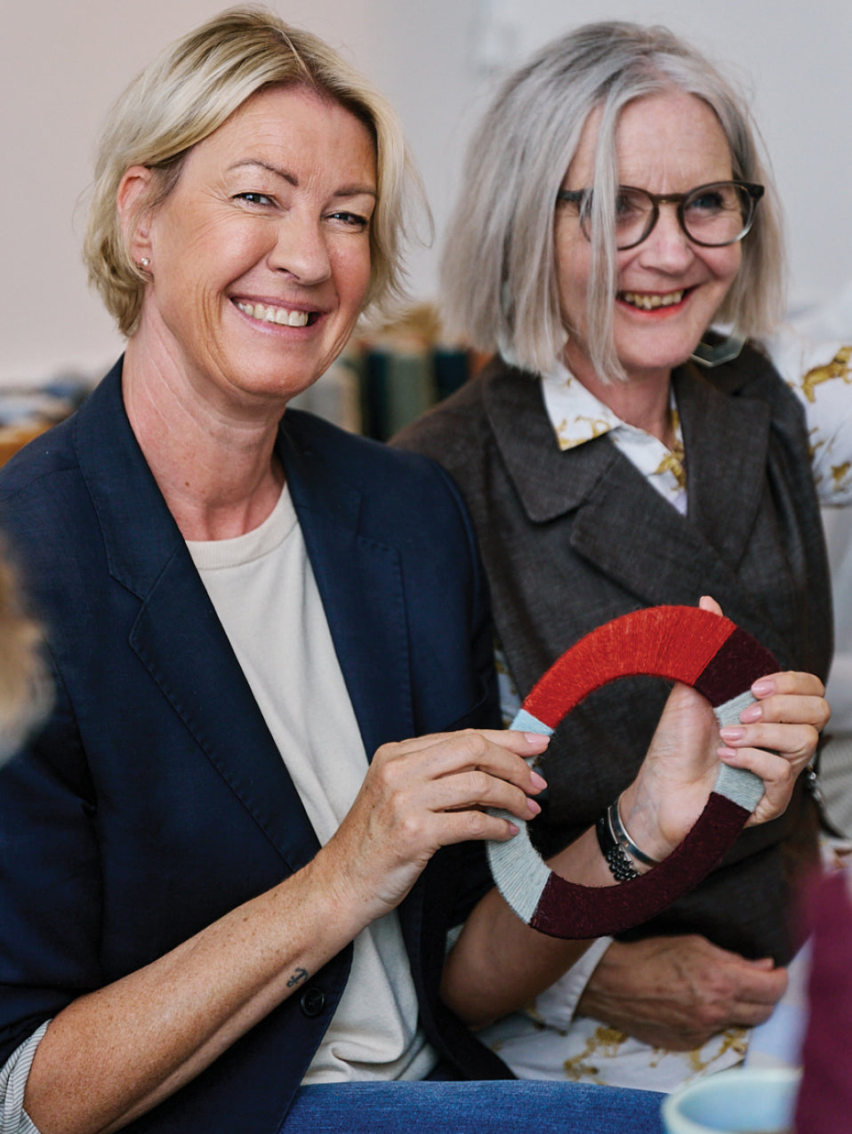
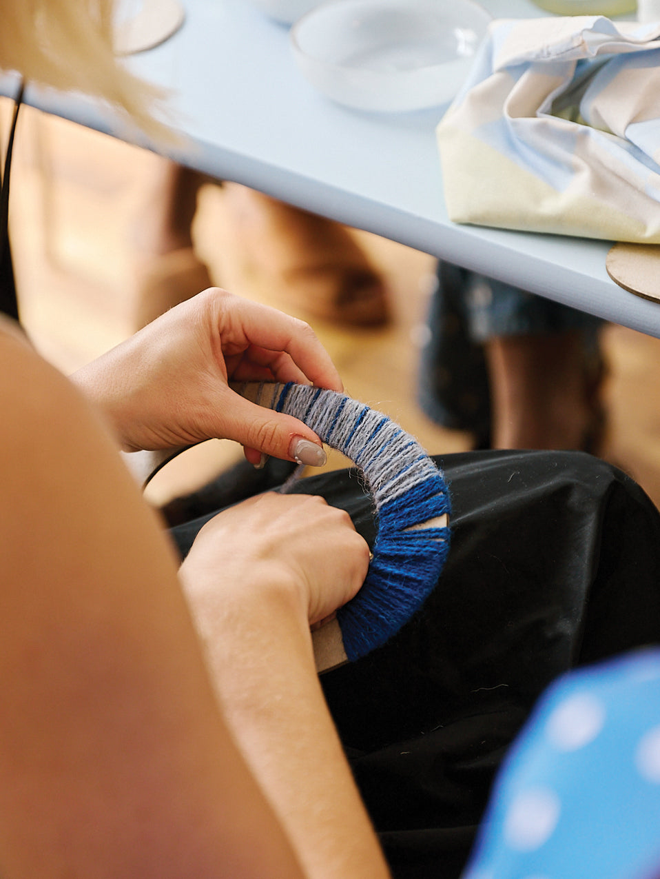
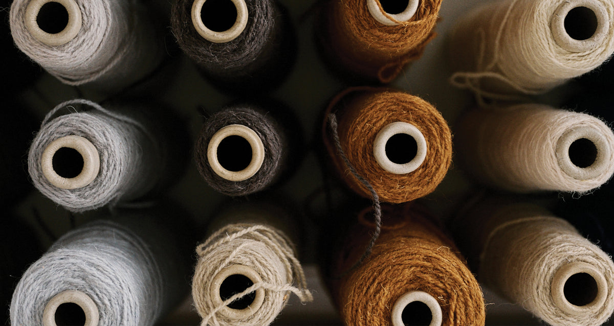
Creative yarn workshop at 3 Days of Design, Copenhagen 2026. Show Mette Ditmer how you style your home with colours: tag @metteditmerdenmark on Instagram.
COLOUR GUIDE: EASY STYLING TIPS
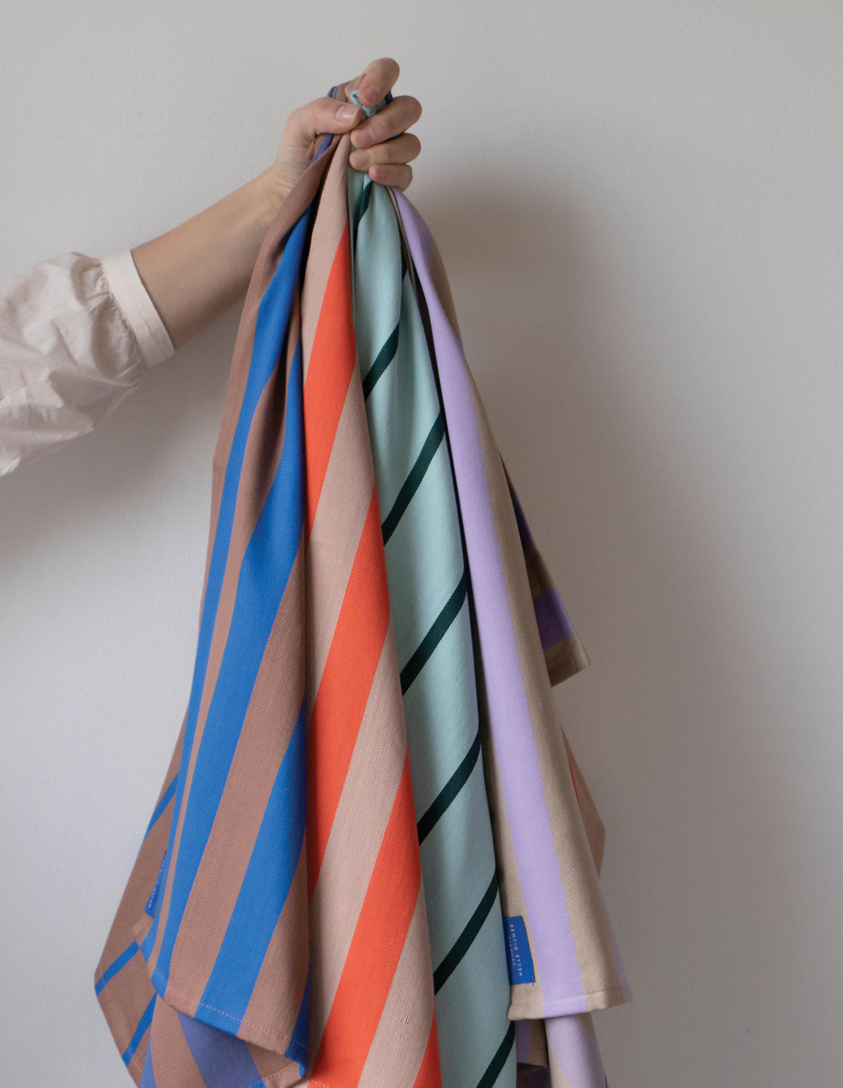
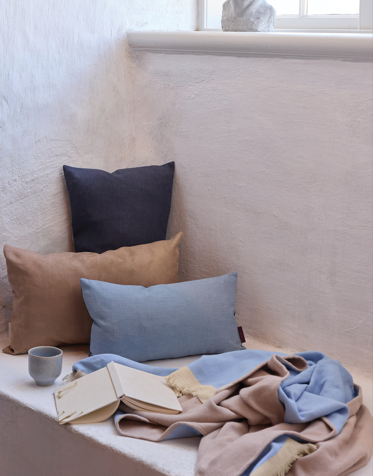
Three easy ways to bring colour into your home without changing everything. Colour is where a home stops looking like a catalogue. Combine the shades that make sense to you, in the amounts that suit your rooms.
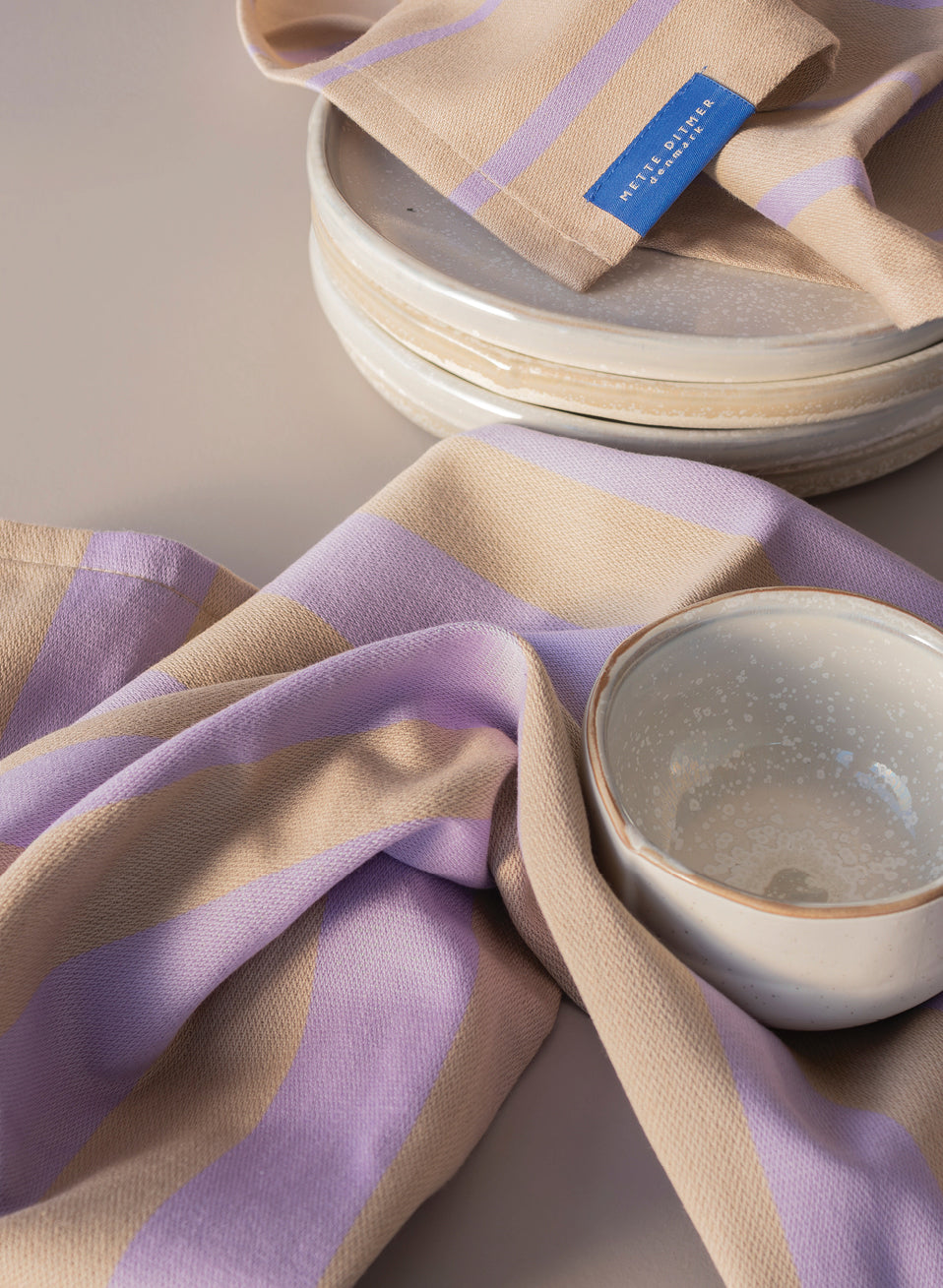
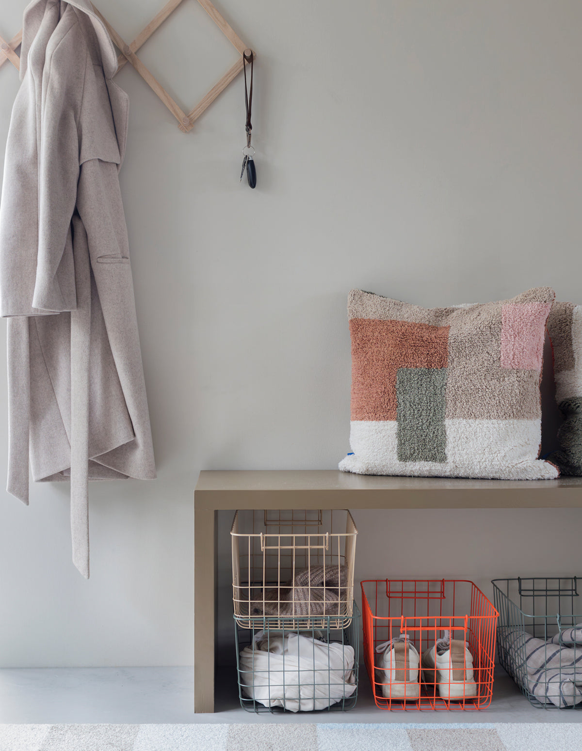
1. Start with a calm base. Sand and latte tones give one colour room to breathe.
2. Add the colour you keep coming back to.
3. Repeat it once or twice, in a different material. Mix solid colours with patterns. Every design can stand alone, but it grows in the company of other colours and materials.
WHERE THE INSPIRATION COMES FROM
Ask Mette Ditmer where an idea began, and the answer is rarely a single place. Her ideas gather slowly, picked up in nature, in art, in architecture, in the quiet of an old monastery, or in a home she visited on the other side of the world. Here’s where she looks.
 NATUREForms, contrasts, lines, calm. Nature never overworks a shape, and neither does she. A weathered stone or a bending branch says more than any sketch could.
 ARTThe wild, the unplanned, the sensuous. Art gives her permission to let go of control. It reminds her that imperfection is often where the character lives.
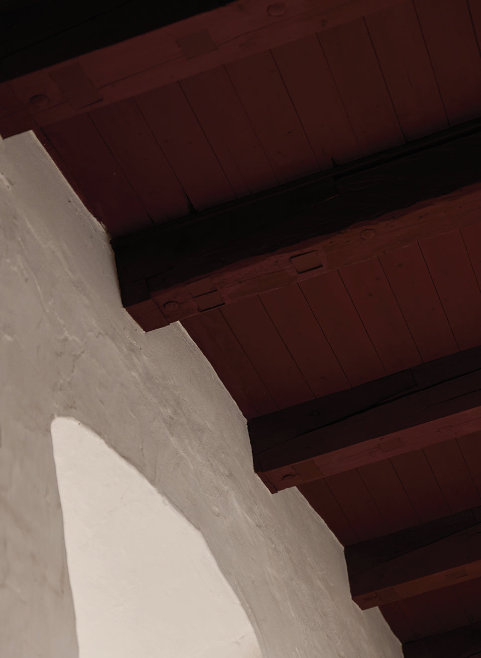
 ARCHITECTURELines, materials, forms and colour. A building teaches her how structure can still feel warm. She studies how a room holds light long before she designs what goes inside it.
 THE STILLNESS OF THE MONASTERYWhere it all began. In silence, the noise falls away and the real ideas surface. It’s here that a vague feeling finally becomes a shape she can hold onto.
 TRAVELSOther cultures, other homes. Every journey brings back a new way of seeing what “home” can mean. She returns each time with an idea she didn’t know she was looking for.

THE ORANGE SIGNATURE
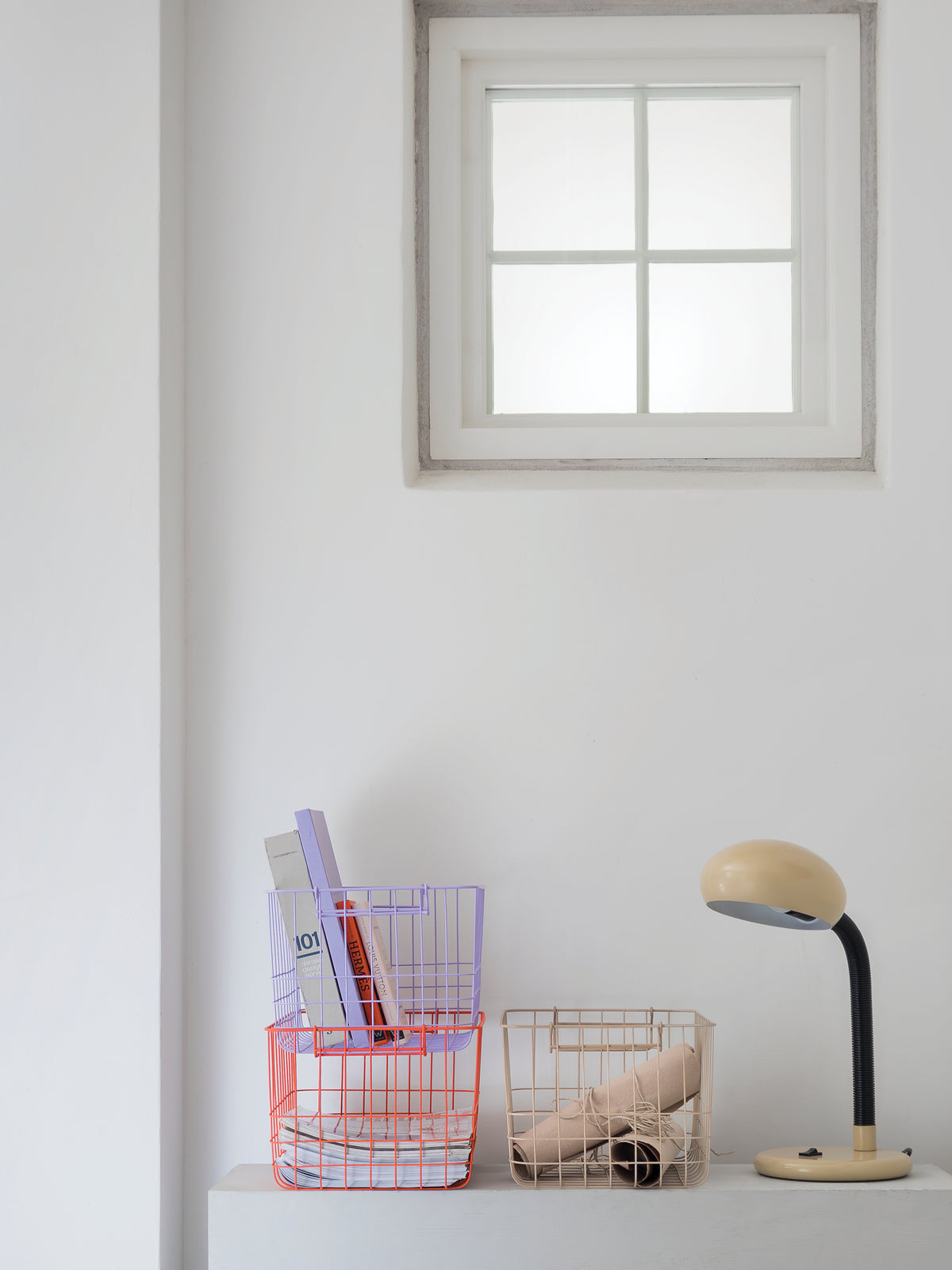
Orange is Mette Ditmer’s signature touch. It appears in the smallest details, from a hangtag to a stripe along an edge, and in the occasional statement piece. A little goes a long way, bringing energy and personality to the room.


